Farrow & Ball’s paint shade, known as Yonder, is capturing the attention of designers and homeowners alike, establishing itself as a modern classic in interior design. This vibrant yet soothing hue of blue stands out for its ability to transform spaces, offering a fresh alternative to traditional navy and pale pastels. As it climbs the ranks of popular paint colors, industry experts are weighing in on whether its appeal can endure beyond the current trend.
Understanding Yonder’s Unique Appeal
The nuanced character of Yonder has made it a favourite among those looking to infuse their homes with a lively atmosphere. According to Patrick O’Donnell, brand ambassador at Farrow & Ball, “Yonder is the crispest and freshest of our light blues,” evoking the joy of morning skies along northern coastlines. He notes that the addition of black pigments helps to temper the brightness, ensuring the shade remains inviting rather than stark.
This versatility allows Yonder to shine in various lighting conditions, particularly in south-facing rooms where natural light enhances its vibrancy. O’Donnell suggests that it’s particularly effective in spaces like guest bedrooms or children’s rooms, where a warm, cheerful color can create a welcoming environment.
Creative Ways to Incorporate Yonder in Your Home
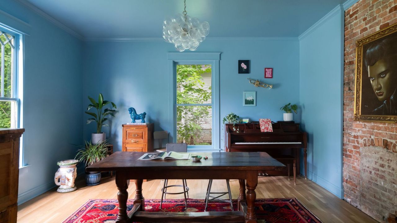
Designers are exploring several innovative approaches to utilize Yonder in their projects. For instance, Kristin Bock of Bock Building Co. chose to envelop a parlor in this lively blue, inspired by a unique thrifted art piece. She describes it as a “playful take on French blue,” highlighting how the shade can evoke happiness and energy in a room.
Meanwhile, Lucy Williams from Lucy Williams Home adopted a bold strategy by using Yonder as the primary color throughout her living room. The result is a snug, cozy atmosphere complemented by warm wooden accents and rich furniture. “There is a lot of depth to this color,” Williams explains, noting how its appeal remains consistent throughout the day as lighting shifts.
Interior designer Sarah Southwell emphasizes the shade’s cheerful qualities, particularly in children’s spaces. She praises Yonder for its ability to energize and brighten any area, making it an ideal choice for playful nooks or cabin beds.
For those looking to incorporate Yonder without fully committing to a blue-drenched room, it also works beautifully as an accent color. Using it on woodwork or cabinetry allows for a stylish yet practical application of this vibrant hue. O’Donnell advises pairing Yonder with neutral tones to create a balanced aesthetic, suggesting combinations with whites or earthy browns for a more sophisticated look.
As this iconic blue continues to gain traction in the interior design world, it is evident that its charm lies not only in its aesthetic appeal but also in its capacity to foster a sense of comfort and joy in any setting. With a thoughtful approach to design, Yonder appears poised to remain a staple in homes well beyond its current popularity.